
Welcome to the world of much to learn about how to make your new website successful. If you’re looking to increase visitor interest in your website you may need to make some adjustments or additions to your site.
It’s important to be aware that it’s not a matter of fixing one or two things on a website to make it successful. Several different aspects contribute to the success of a website.
No doubt you spent hours deciding on the right WordPress theme to use for the niche of your choice.
You’ve searched the internet to find answers to your question of how to keep visitors interested for a longer period before leaving your site.
I’m sure you’ve read about SEO and how to get visitors to a website. But now your question is how to keep those visitors interested enough to stay on your website for several minutes, half an hour, or maybe longer.
So, here are things to consider:
Table of Contents
The Layout of Your Website
- How many columns are on your website – 1, 2 or 3
- If more than 1 column, what is the layout.
How Attractive is Your Website
- Does it have a White background?
- What text font are you using?
- Is the text colour Black?
- Are the colours on your website, other than the background and font, overpowering?
- Or, are the colours dull and uninteresting?
- Does your site have an easy-to-navigate Menu?
Are There Distractions on Your Website
- Have you included Advertisements in the Sidebar, or within the written content?
- If so, how many Advertisements and what type of ads are they?
Having identified facts that may be causing visitors to leave your site, let’s look at what improvements can be made.
8 Steps to Increase Visitor Interest in Your Website
1. Layout
The first thing to look at is the layout of the WordPress theme your site is built on.
Ideally, the Theme allows for two columns. The wider column on the left-hand side provides for content to be read from left to right, without distraction.
The narrow column on the right-hand side provides for the insertion of widgets, which we will discuss further into this post.
Some webmasters prefer a One-page layout. Although an option, this appears to be not so popular with new webmasters.
2. Background
Aim for a White background as this provides for easier reading. Coloured backgrounds are not ideal. We all have our favourite likes and dislikes when it comes to colours.
 Just imagine yourself searching the internet for important information that will make a difference to your life, in one way or another. You find a title to a website that appears to be just what you need. You click on a link and arrive on a page with a background in a colour you just can’t cope with.
How long will you stay on that page? Are you finding the words so interesting and valuable that you put up with the distasteful colour to get the information you need?
Or, maybe the content doesn’t appear quite as good as you hoped for. Therefore, there is nothing to entice you to stay on that page. You leave it immediately.
Now, that page may have had some excellent advice a few paragraphs into the content. But, the owner lost that visitor to the website simply because of the lack of a White coloured background.
3. Text Color
Black text on a White background makes for easy reading by most people.
When designing our websites it is wise and thoughtful to consider people who may not have the best of sight. This can be anyone of any age.
If the content on your website is difficult for a visitor to read, that visitor will leave your site.
Some people recommend using Dark Blue for text. I consider Black as in #000000 to be the most suitable choice.
4. Text Font
Make sure the text font is large enough to be easily read. I suggest you do not have the font too large, as it can give an appearance of being screamed at.
The font on this website is Helvetica – Normal – 17 pixels.
5. Other Colors
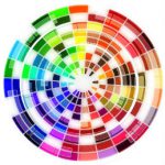 In addition to the page layout and font and text colours, there will be other colours such as a logo, widget headers, and maybe some banners.
Attempt to keep these colours pleasing to the eye. Try to avoid loud colours that grab too much attention of the reader. Alternatively, avoid dull and uninteresting colours.
There are many suggestions on the best colours to use on websites, but your own likes and dislikes will be the major influence on your design.
There is psychology about colours to use on a website but that is another subject on its own. For now, I suggest relying on your judgement as to the colours you choose for your site.
6. Menu
Every website requires a Custom Primary Menu inserted either above the website header or below the website header.
The Menu should be simple in style and easy for visitors to navigate
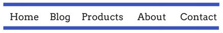
A Secondary Menu should be included for linking to legal pages such as Privacy Policy, Disclaimer and Disclosure. The Secondary Menu is either displayed in the Sidebar or in the Footer of the website.
7. Distractions on Your Site
I’m sure you’ve seen website pages that include advertisements.
There are so many types of advertisements available for easy insertion on websites.
For instance – Google Adsense
These are not easily available as a website needs to be approved by Google. However, it is not too difficult to get approval.
Unless you have thousands of visitors per day to your website, your financial reward from Google Adsense will be small. It’s your decision to weigh up the value of receiving cents for clicks on Adsense ads, as against receiving dollars for sales of your own products, or commissions on affiliate products.
Amazon CPM advertisements
These are available for Amazon Affiliates to place on their websites. Again, the reward is cents.
All these advertisements distract from a visitor’s concentration on reading the important content you have provided on your website. The attention of a visitor can so easily be drawn to an advertisement. Whereas, if advertisements were not included on your page, your valuable and appealing written content has a much greater chance of being read.
Comparison Between Searching Online vs Brick and Mortar Store
Just imagine walking into a brick and mortar store, knowing the product you are interested in purchasing. However, so many other products are displayed all around you and it’s difficult to find what you are intent on purchasing. At least in a brick and mortar store, you can ask for assistance. On a website, there is no one to help you with your choice.
That is what it is like for visitors to your site. When they are distracted by advertisements and banners they decide it’s too hard and look for the exit button, or simply end their session on the internet.
Consider an Alternative to Earn from Display Advertisements
If you really are intent on earning from display advertisements, you might like to consider building a second website around another interest. There definitely can be money made from displays ads, but don’t ruin your valuable e-commerce or affiliate marketing website for these ads. It’s not worth it.
8. The Desired Bounce Rate
This is a more technical aspect of your website. However, it is important and something that most website owners are concerned with.
What we are talking about here is Bounce Rate which is influenced by the activity of visitors to your site.
In elementary terms, to achieve a good Bounce Rate it’s important to create adequate interest enticing visitors to stay on a page for a considerable length of time.
Visitors will move through your site by clicking on internal links inserted in your posts or pages. Alternatively, they will click on the Menu, Recent Posts or Categories if you have them listed.
Ideally, visitors to your site will be genuinely interested in your content and move from one page to another, seeking help from the knowledgeable content you have provided.
Thank you for visiting my website and reading to the end of this post.
If you wish to learn more about building a successful website to promote your interests, I invite you to read my Review of Wealthy Affiliate.
If you are interested in earning income online, I’m sure you will find the review helpful.
I welcome your comments and questions.
Hello there! I just recently created my website. I wanted to increase my visitor but the problem is that I don’t know how. Luckily, I found and read your article on how to increase visitor interest on my website. I think this is the perfect guide and tips that will surely help newbies like me. Thank you for sharing this and I will surely follow this to increase my visitor.
Hi John
Thank you for leaving your comment.
I am very pleased you found something in this article that will help you increase the number of visitors to your website.
If you follow the 8 tips in the article and continue adding new content, you should soon see an increase in visitors to your site.
All the best.
Hi Vlerie; Your post have perked up my interest. I have read the whole article, it is good from start to finish.
You have spoken on almost all the vital areas that leads to success. I personally cannot stay on a site that have black or red background, small or pale font. It is damaging to my eyes.
Haw can you Make writers change their style?
DorcasW
Hi DorcasW,
Thank you very much for leaving your comment. I’m pleased to know my post was easy for you to read because of the simplicity of color and layout.
I understand how it is for you when attempting to read colored screens and small font. It is very bad for our eyes to have the strain of attempting to read some overly colored websites.
I can’t understand the reasoning of some webmasters. After all, it’s the subject and quality of content that counts, rather than color and design.
All the best.
Thanks for the interesting post, Valerie!
I think you’re spot on when you say the layout is a big factor in creating an attractive website. Font and Font size is something I’ve messed about with a bit and at the moment my size is 18 but I’m considering decreasing it to 17. What would you recommend?
I also have my H1 and H2 at 35 and 39, respectively. Do you think this is too big for headers?
Thanks!
Hi Stephen,
Thanks very much for visiting this post and leaving your comment.
To answer your question regarding Font size, I would say that 18 or 17 pixels would be appropriate for the general text.
With regard to the H1 and H2 headers, pixel size of 35 and 39 are larger than I would expect to find on a website. However, without seeing your website it’s not easy to make comment.
Yeah, basically you have to keep it simple and easy to navigate and interact on your website. If there’s just too much going on, most likely your visitors will get distracted and then leave your website. I think it is also really important to make your website load really fast, because nowadays people want everything presented in front of them quickly. If the website takes longer than 3 seconds to load, most of your visitors will leave the site immediately.
Hi, and thanks for visiting my website.
Yes, it is true that people will leave a page that has distractions on it. I’ve read comments left by visitors to sites with too much stuff going on, and what’s better than learning from visitors. It’s important to note their feedback
I agree totally about how long a site takes to load. It’s a fast moving world we are living in and people don’t have time to wait for a website to display.
Thanks so much for your info on how to increase interest in your site. I especially appreciate the advice on the background color. I had never thought about it much, but I can see how a certain color might be irritating to some people. I’ve always had a white background on my site and tried to keep my menu options easy to navigate. Thanks so much for the good info!
Thank you for leaving your comment. I’m pleased to learn you have a white background on your website, along with a well functioning menu
It’s good to know you picked up on background color. You will be able to point new website owners in the right direction.
Thanks again, JD.
Wishing you all the best.